Tuesday, May 1, 2012

Change is good so it's time to say goodbye

"Change this, and this, and this. Then you're done. Actually, change these 7 things too, and don't forget...."
Sounds terrible but really, it makes everything that much better, change is good.


Change, according to Dictionary.com means to make the form, naturecontent, future course, etc., of  (something) different from what it is or from what it wouldbe if left alone. 


In essence, change can be good or bad, it is all what we make of it after the change has occurred.


So on my last post, I thought that I was almost done with my final assignment for the semester. Now, after 7 more hours of work, I believe it is complete. 


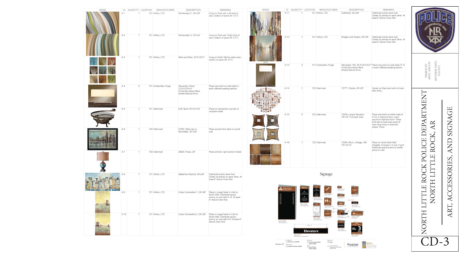
I had a great time selecting art and accessories for this project. It is something that I knew I needed to focus on from then beginning and so I did. 


It is crazy to me that this semester is over as of tomorrow. 


To change. That is what I am doing. I am changing the place I lay my head, I am going to live in a state other than the one I have lived in my entire life. I am going to work in a position that is not what I studied in college BUT is a huge passion of mine. I am moving 927 miles away from all my friends and family. 


I am going to work for Walt Disney World in Orlando, Fl. I will work as a concierge in a Disney Resort and hope to bring more joy than one can image to all guest who I come into contact with. I can not image how any job could be better for me right now. 


Wish me luck. If you want to keep up with me, follow my disney blog Ariel and Disney!


-Ariel

Thursday, April 26, 2012

The semester is almost over but I honestly can't believe that I have two more classes and then it's done. No more studio. No more college. I'm done. Graduating. No more school...ever...kinda. I find learning fun so I'll be taking classes in Flordia. :)

Here is what I am working on my final weeks of studio!
These are a part of Construction Documents, a part we have not done before but I am loving it! There is a finishes plan and a furniture plan. They are both vital in the process of putting together a facility after all the designing is complete!


They are hard to see even at this scale, if you would like to view them larger just click on the image.

Questions and Comments are always welcome!

Thanks for reading!
-Ariel

Monday, April 23, 2012

Looking back at the Fall

It's hard to believe that this is coming to an end but alas, the time has come!

Let's look back on last semester and how I got to where I am now...

Overall, I am beyond happy that I choose to design a Police Department. It sent me searching for information in places that I would never expect.

I visited the Benton County Jail, Washington County Jail, Fayetteville Police Department, and Bentonville Police Department.

One of the coolest things I found was at the Fayetteville Police Department. This is a storage unit for things as small as a toothpick to as large as an ice chest. The best part is how much space it saves by closing each shelving unit on it's self. It follows a track on the floor! They can be moved manually or electronically depending on the budget of the facility!


Another interesting excursion was to the jails. In Benton County I was actually allowed to go into a cell and take a few pictures so here are a few to ease your inquiring minds. Yes, they are as plain as you imagine.


One last thing that I did that was SO much fun was visit the Washington County Sheriff's Office. They have an on site shooting range and I had the opportunity to shoot a gun for the first time. Check out how I did!
I was scared....
...but it was just a computer program to start the training


This is how I did. Pretty good!!
Then we went outside and it was real.


That concludes the highlights looking back on last semester.
Comments are welcomed and appreciated!
-Ariel


Sunday, April 8, 2012

IMAGES!!

As this project is coming to a close I would like to share a few of my images.
Inside the break room. This image shows the main cabinets and sink area as well as a bar where officers can sit and read or eat during their break.

This is a section through the main corridor space. This shows two collaboration spaces where employees can break away from their usual work area but still be productive in a secure environment.

This is the gym space. There is also a connected area for physical training session.


Comments are welcome!
<3-Ariel

Sunday, March 18, 2012

New and Improved - Circulation

As I stated in the previous post, these are the NEW AND IMPROVED ff&e selections.

This is the update for the Circulation space.

The left side gives a general idea of what the wall will look like, paint above the chair rail and a wall covering below.
The art pieces will be used primarily in nooks and others throughout the halls between the sconces. Not all art in shown but this gives an idea of what the art will look like.
Luxury vinyl tile is used throughout the circulation space.
The lounge furniture at right will be used in nooks throughout the circulation space to serve as a break away from the standard workstation.

Questions and Comments are always welcome.
<3 - Ariel

New and Improved - Arrival

The next few posts will be about NEW AND IMPROVED ff&e selections.

This is the ARRIVAL space.

This shows the flooring pattern for the space.
The majority of the space is 18"x18" luxery vinyl tile. (LVT1& 2)
Each sitting area is broadloom carpet (CPT1) with a 4"x48" vinyl plank (VP1)  boarder.
All selections are in the image below labeled accordingly. 
The left side of the image shows the paint selections as well as the chair rail and cove base with the selected color.
The tall wall sconce lighting will be used in the reception window.
The linear sconce lighting will be used down the main corridor of the arrival space which includes the doors to the restrooms, elevators, and stair access.
The art selections at the top are to be used on the right side of the reception window.

Questions and Comments are always welcome.
<3 - Ariel

Friday, March 16, 2012

Let's take a look ahead...

In planning for my final presentation I have begun thinking about page layouts. This isn't until April 16th but it doesn't hurt to look ahead now does it?

I am considering using 11x17 boards because they are easy to travel with but I am questioning if everything will be visually large enough on this size board.

I always try to take something from every experience I have. When I think about junior presentations the critique that stands out in my mind is that the plan was either not large enough, not at a comfortable place for viewing, or not at a "normal" scale. I want to make sure I do NOT make any of these mistakes and that is why i question the 11x17 board. I might have to design the rest of the presentation around the board on which my plan will be placed. That is not a bad plan actually.

I plan on using a tan/beige matt board for my material boards because I feel like black will be to dark and white is easy to show an "oopsie."

My material selections are expanding but there is still more to do. That will be my goal over spring break.

This is a lot of words but that is how I think things out. I don't want to show a picture yet because, who doesn't like surprises!

</3 Ariel

Sunday, March 4, 2012

So, what all do you do?

Many people wonder what an Interior Designer does. Beyond space planning which you've seen in previous post, designers do assign materials to the interior. Let's take a look at what all is included.

For this project we have to choose 10 spaces and be sure to assign everything that is needed, as far as design, for those spaces. 
This will include: 
  • flooring
  • wall base
  • paint
  • wall coving
  • chair rail (if chosen)
  • seating with fabric and finish selection
  • occasional tables with finish selections
  • work stations with fabric and finish selections
  • task chairs with fabric and finish selections
  • ceiling paint
  • ceiling enhancements with acoustical properties
  • lighting (recessed, sconces, pendants, task lighting, table lamps, etc)
  • art 
  • accessories
  • etc. 
As you can see, there is a lot that must be addressed.

Due to the amount of things I have to remember, I have begun creating a list for each space with everything that must be included in that space to help organize myself. Some of these you have seen on my furniture/accessories sheets with each space. 

There are many things that I still have to decide on and get approved by the profs. One things that I always seem to overlook is wall base. So, today I decided on two big things, wall base and chair rail profiles. I haven't chosen a color for either yet, but samples are on the way. :)

Here are the profiles for all three I have chosen.
This is the Chair Rail Profile. It is Johnsonite, Bastion, 4" Chair Rail.

This is the basic wall base profile. It is Johnsonite, standard rubber wall base. 

This is the more decorative wall base Profile. It is Johnsonite, Milwork Series, Silhouette 4" Wall Base.

As always, comments are welcomed and appreciated. :)
<3 - Ariel

Sunday, February 26, 2012

Courtroom

This week I took on the Courtroom because I knew it was going to be a struggle. I have changed the area a lot so here is another updated plan. (Do you see this becoming a theme? haha)

Here is a zoomed in view of the courtroom space. The space behind the the jury stand is a jury deliberation room.

Here are some of the selections I have made for this space.

From Left to Right:
The newest paint selections are on the far left.
The upper flooring pattern will be used down the center isle into the courtroom using the colors to the right
The carpet below will cover the remainder of the floor excluding the main court floor which will be plank flooring similar to the arrival and circulation (5"x48") using the top most color.
The auditorium seating will be used inside for viewing seating and the fabrics below will cover them. The stripes will be on the back and the brown will be on the seat.
Sconces at far right will be used similar to the image with auditorium seating on portions of the wall used for vertical inflection. Please note the similarity to the scones being used in the hallways.
The image directly below the sconce is the jury chair and the chair below that is used for lawyers and other representation. 

As always, comments are welcomed and appreciated! 
<3- Ariel

Friday, February 17, 2012

Arrival & Circulation

In class we have been exploring ways to enhance our spaces. I interpret that was a way to make the spaces more inviting and comfortable but also to do the job in which they are intended to do. This week we worked on Arrival and Circulation. I had a great time with both. :) Here are some furniture, fixtures, and accessories images from what I've done.

On the far left are the paint colors. All are Sherwin Williams colors. These are for the entire building. The upper two will be used most common while the lower two serve as accent colors.
The flooring is comprised of two 18x18 luxury vinyl tiles with a boarder of 5x48 commercial Laminate Plank.
The pendant will be used in the larger nook by the courtroom. The sconces directly below will be used down all corridors. I am still looking for recessed lighting to use. 
The chairs and tables at far right will be used through out the entire building but most commonly in the arrival and corridors. (Note: These are NOT the final finishes in the image)
Though I am still working on fabric selection. The fabrics at top are to be used on guest seating. The stripes will cover the front and back of the chair while the solid blue will cover the seat.
I found these lamps which look awesome and I want to find a place to incorporate them, we shall see. 
I will have preliminary images of these spaces coming soon so keep an eye out!! :)

Comments, as always, are welcomed and appreciated!!

<3-Ariel

**UPDATE**

Here is an image of the updated plan.
For reference you may look back at the previous post. Please note the arrival changes as well as circulation around the investigator offices. There are also changes down the primary corridor .


Thursday, February 9, 2012

A PLAN BY ANY OTHER NAME...

After a long road of work (about a week and a half. haha) I have a plan that seems very functional and appropriate for my project type. Remember, this is a Police Department and Courtroom in North Little Rock, Arkansas. The plan is missing a few chairs, the storage units for evidence and records and all the gym equipment (among other things) but you get the general idea.

For the record: I have the plan as large as it will get on here but for a closer look it might be able to download larger.


I am still in the process of finishing obviously, but that is what this semester is all about...DESIGNING this facility!

Here are some 3D images of the workstations. Keep in mind these are just the manufacturer drawings and are not the materials used in the project necessarily.
This will be used in all managerial type offices. Note the openness of the office
but there is still a great amount of storage space for the user. 
This will be used for administrative offices. Note the storage area at the edge of
each workstation for personal belongings.

This will be used for all investigator offices. There is a lot of space for storage as well as work surface area in this workstation. Panels can be raised between each workstation as well for greater auditory and visual privacy. 


I can't wait to show you more next week! It will be great fun!

As always, comments are welcome and appreciated!

Thursday, February 2, 2012

Paint & Chairs

Though we are focusing very much on plan and organization of the building in studio, I have been putting a lot of thought and time into the color palette and furniture for the facility. This is always the hardest part for me so I want to give it all I've got!

I found a great color palette that relates to the one I believe fits best from the last blog. The colors are generally neutral but adding a bit of blue here and there will give excitement to the facility. All colors are from Sherwin Williams.


I found a great guest chair from First Office. It is simple and perfect for this facility. These chairs will be used in the waiting areas around the facility as well as in closed offices for any visitors. I have not chosen any fabrics for these as of yet but I will be narrowing down pretty soon and I'll keep you up to date!


First Office is also where I found great task chairs! It seems to be a wonderful source that I hadn't looked to in the past and I am very glad that I came upon it. These task chairs are slightly different but will allow for some personalization of workstations for the employees.


There is still much to do and so I will get back to it! Please leave comments and suggestions!


Sunday, January 22, 2012

Senior Project - Lets Talk Concept

This year my project is the design of a police department and courtroom. The building is in North Little Rock, AR and because of this all design decisions are made with consideration of the location of the building.

The concept is a major piece that will focus the project throughout the entire design process.

This concept is derived from the basic principles of police work, to protect and serve. These principles can be seen in the design of the police badge through visual hierarchy, continuity, as well as the iconography of the badge itself.  The badge is representational of solidity and security of the officer as well as the police department as a whole. These aspects will influence the design by incorporating solids and non-solids through the facility to emphasize location and promote wayfinding. The badge is designed with a visual sense of hierarchy; that design will be reflected within the form of the interior of the facility. The facility will exhibit a sense of continuity, one team, but still show the hierarchy which defines the company. There is a fine line between protecting and serving in the police world. This balance will be seen though the separation of secure and non-secure areas of the facility. 

I love the idea of incorporating "police blues" into the design while also adding a POP of color!


These are some images that will guide the design of this facility. 
 
These are hard working people, and their hard work should
be shown and appreciated through the design of this facility.
City streets are a part of police daily work.


Reminders of why they do the job they do.
The reflection in this image in combination
with stone and blue could be a great design opportunity.

This is going to be a great project, let me know your thoughts